Roar Bikes
Brief
Roar Bikes is a manufacturer of small run, contemporary bicycles sold exclusively from their own website. Roar Bikes currently have 3 models of bike to purchase (Siamese, Sphynx, Bengal)
Goal
To build a e-commerce website for people to browse and purchase

Understand
Simple User Story: Jake wants e-commerce website to buy a bicycle
Improved User Story: As a graphic designer, Jake always notice imperfection of visuals on websites first. Sometimes, he even understand that this quality lead him to miss some great products or services, just because the website he visited was not great.
Once, he decided to buy a contemporary bicycle to be like his hipster boss. By this, he wanted to stand out from the crowd and be appreciated in his local design community.
He visited a few websites of bikes’ producers such as: www.swiftyscooters.com , www.yeticycles.com , www.santacruzbicycles.com . At all websites he only saw a generic approach to webdesign. How could they help him to stand out from the crowd if their website are full of stamps? Finally, he opened a Roar Bikes…
Therefore:
1. Inability to provide a well-designed, modern UI components in website is causing a decrease of customer’s affluence on the website.
2. Giving users a trendy UI design systems on the website would increase the number of prospective customers with design background registrations and potentially increase sales.

User Journey
In conjunction with a story, the main decision-making points for Jake happens on the stage of familiarization with website. In other words, his first impression matters the most and those 10-20 seconds of scrolling website makes him to decide whether to continue using a website or not.
In addition, obvious decision-making processes such as whether he likes a product or price will be neglected here
Jake found a Roar Bikes from a google search “Custom/contemporary Bikes”. First, he analyzing a visual components such as colours’ compatibility, pictures, fonts pairing.
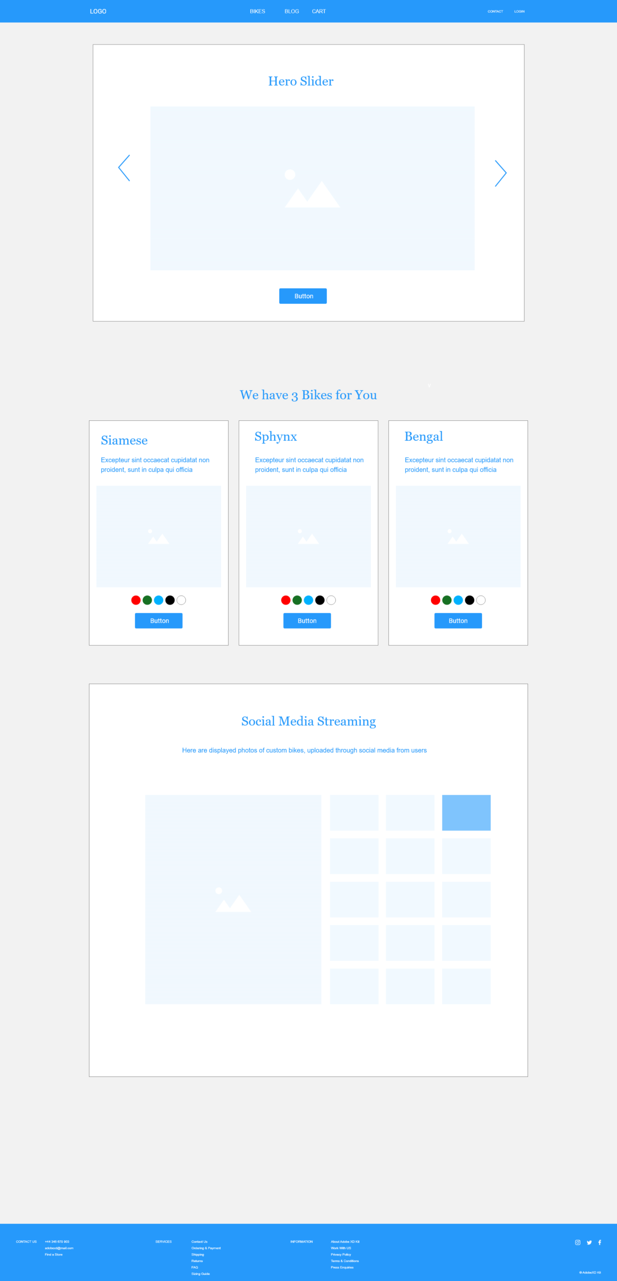
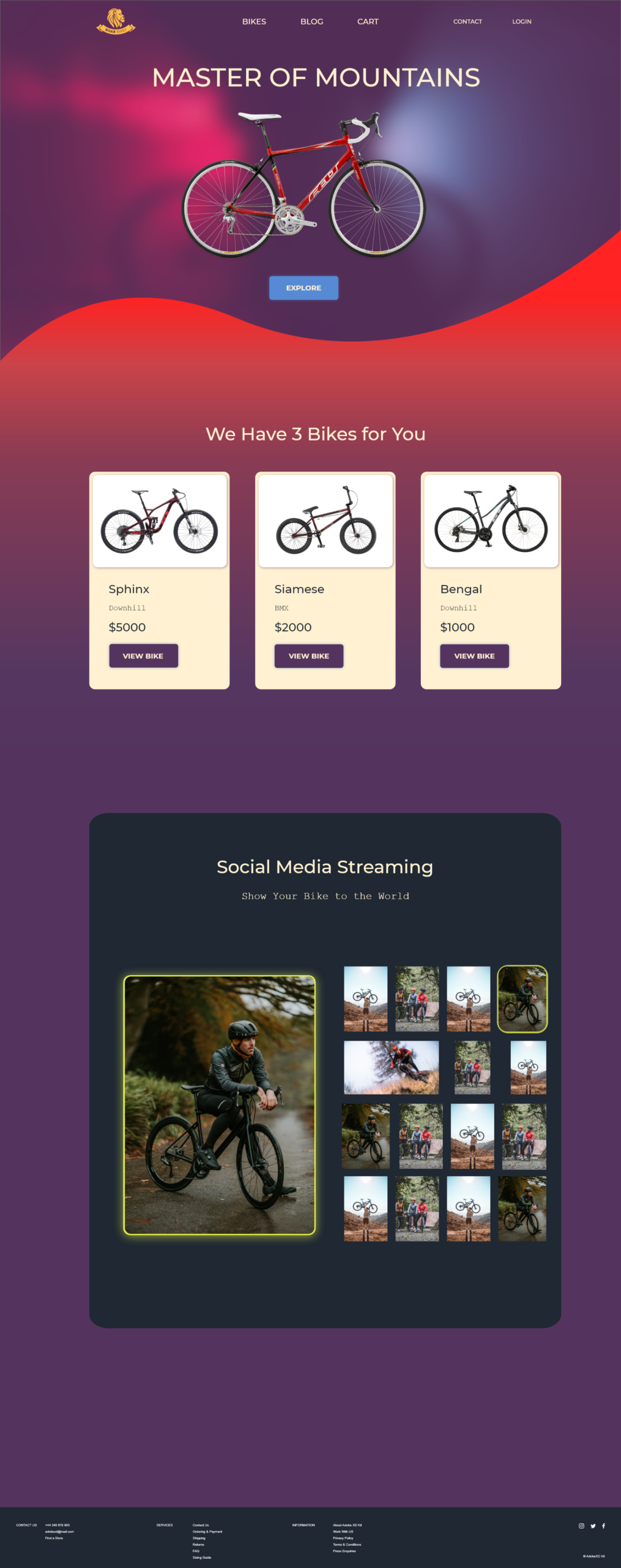
It seems, he likes a visuals, so he starts looking at bicycles. There are 2 section on the homepage where he can take a look of products: Hero slider and product page, demonstrated as a 3 cards.
Jake likes what he sees, and he feels inspired that these bikes can help him to stand out from the crowd. He even imagined how his hipster boss will say “Jake you have a unique bike. I have never seen it before”.
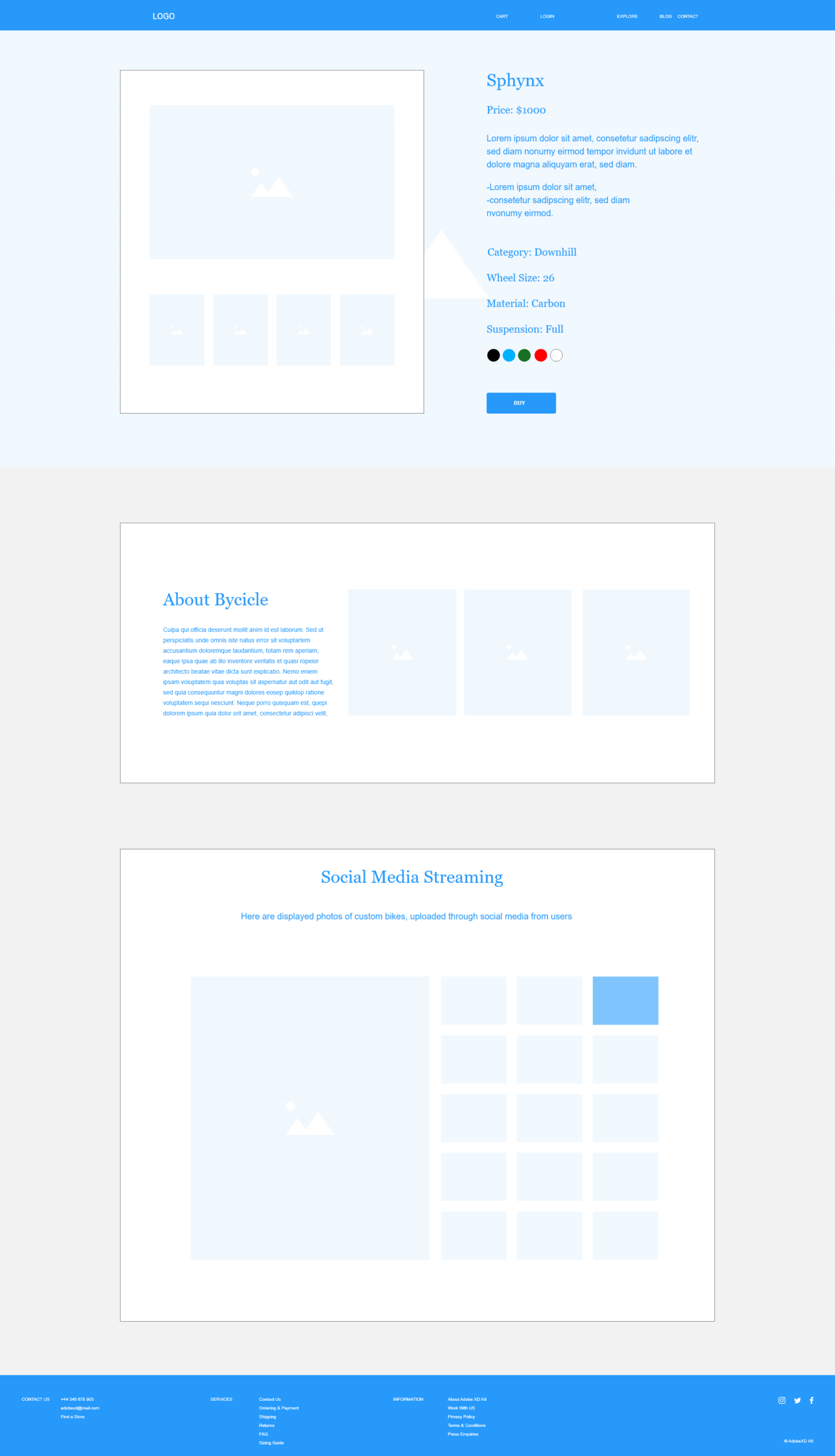
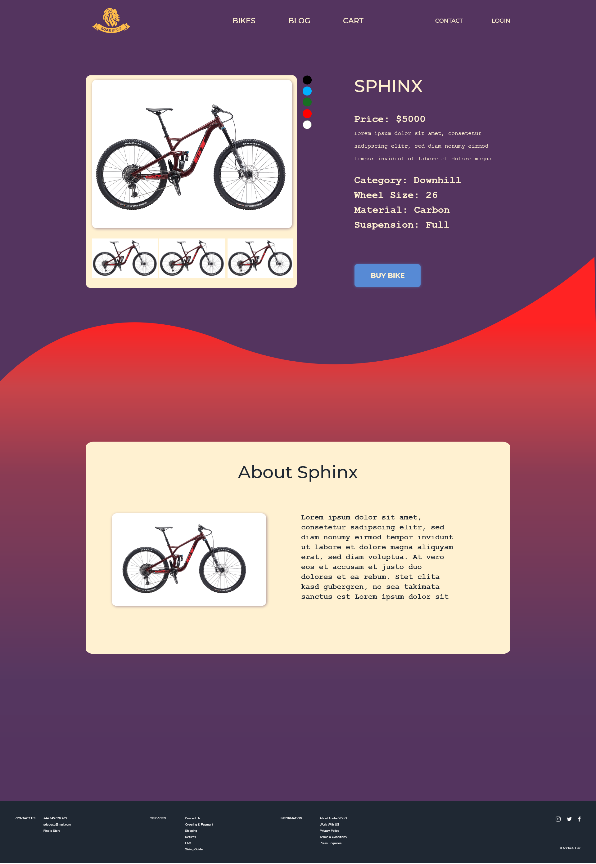
But he still a bit doubt, so he goes on product page of chosen bike. There he can see a variations of colours, sizes and modifications to make his bike truly custom.
Jake has chosen the one bike. Now he wants to buy it.
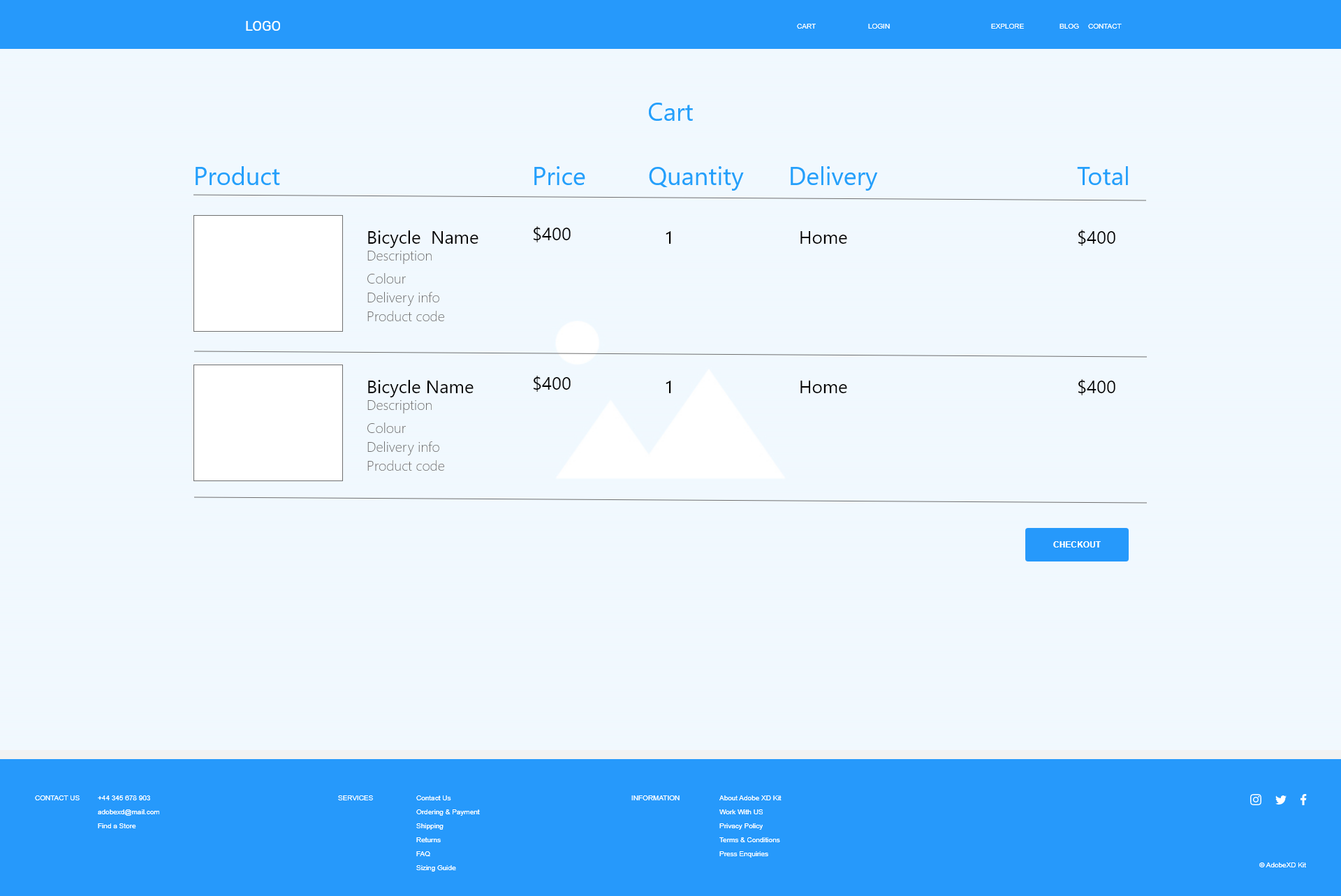
He adds the one to cart and proceed to the cart page where he can modify his order and choose a delivery method.
Good job, Jake. Since now design community does not sleep at night, everybody wants the same bike.
Its been few months since Jake got his bike. Now he wants to upgrade his bike.
Where he can find new details and stickers? On the same Roar Bikes website. He is searching again from google search and coming back to the familiar website.
There is not a secret that his purchase made his colleagues want to buy something from Roar Bikes too. Since it is a design community, everyone pays attention on UI components of website.

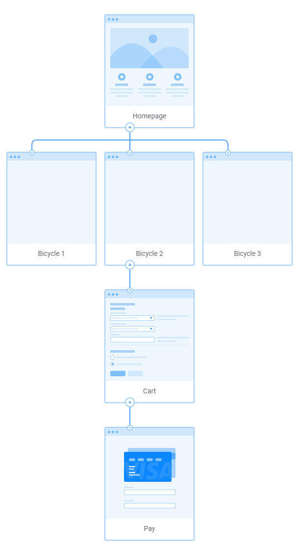
Web Map
Since this is a simple e-commerce website for small manufacturer, it consists of a minimum number of layers
- HomePage
- Menu
- Hero Slider
- 3 Cards with products
- Social Media Streaming
- Footer
- Product Page
- Image
- Colour pallete
- Size
- Style
- Customization options
- Cart
- Payment
Wireframes
It has been chosen a simple, non-distracting layout in order to make customers focus on production (Pictures of bicycles)
Design
On this stage I discovered an interesting solution for hero slider. I found a photo of a bicycle with a dipped beam and side lights on the back. Then I applied a dark translucent layer with a strong blur. This made it possible to create a semi-abstract substrate for a real photo of a bicycle. Thus, it turned out that the real object emits light from the background.
Also, I found an interesting combination between desaturated purple and reddish-orange with a lower tone. The latter was used for accents and also for a wave-like arc simulating the descents and ascents of the mountains
Cards with products were made in high contrast to the background to increase perception.
Regarding the typefaces I have chosen a font pair Montserrat- Courier in order to emphasis a combination of modern design and mechanical identity of bicycles.
Fonts
Montserrat
Courier
Colors

Tools

