National University of Singapore

Brief
The National University of Singapore (NUS) retains its position as one of Asia’s best universities at 11th globally in the latest Quacquarelli Symonds (QS) World University Rankings 2020
Goal
To improve a current UX system of the NUS website in order to provide visitors a seamless information gathering and interaction experience.
Understand
User Story
In order to establish a human-centered approach of UX system, it were developed a 2 personas, that represent a common user.
One of the goals was to create so-called “Imperfect User Personas”. Currently, UX designers tend to create a portraits of people, that usually do not exist in reality with their overwhelming happiness. In this particular cases, personas were intentionally endowed with the features of ordinary people, whose activity at some point was intersected with the website.
Personas
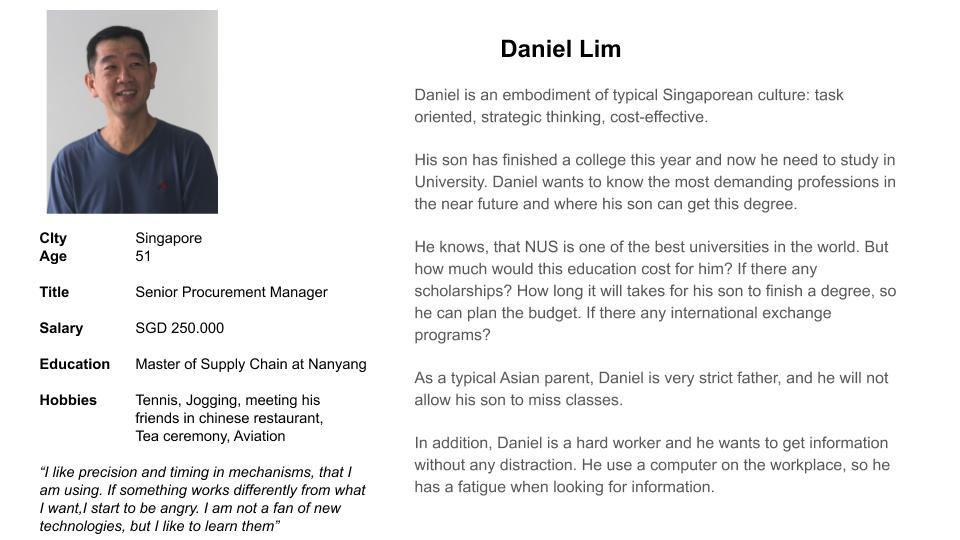
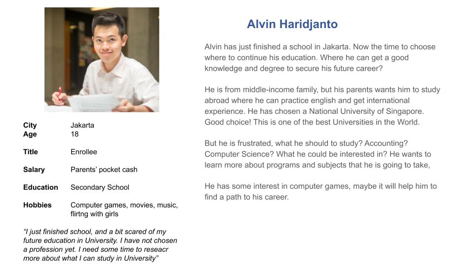
Therefore:
- Inability to provide a clear navigation on the website to help users like Daniel find the relevant information about courses will decrease credibility of NUS.
- Giving users a core information at first will help them to familiarize with offered education programmes and conditions. This in turn will help them with their decision making process.
User Flows
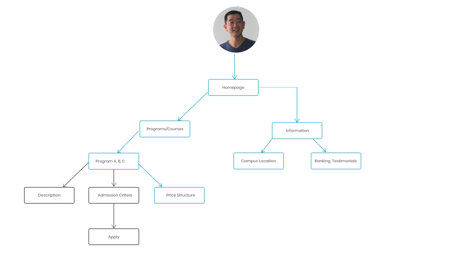
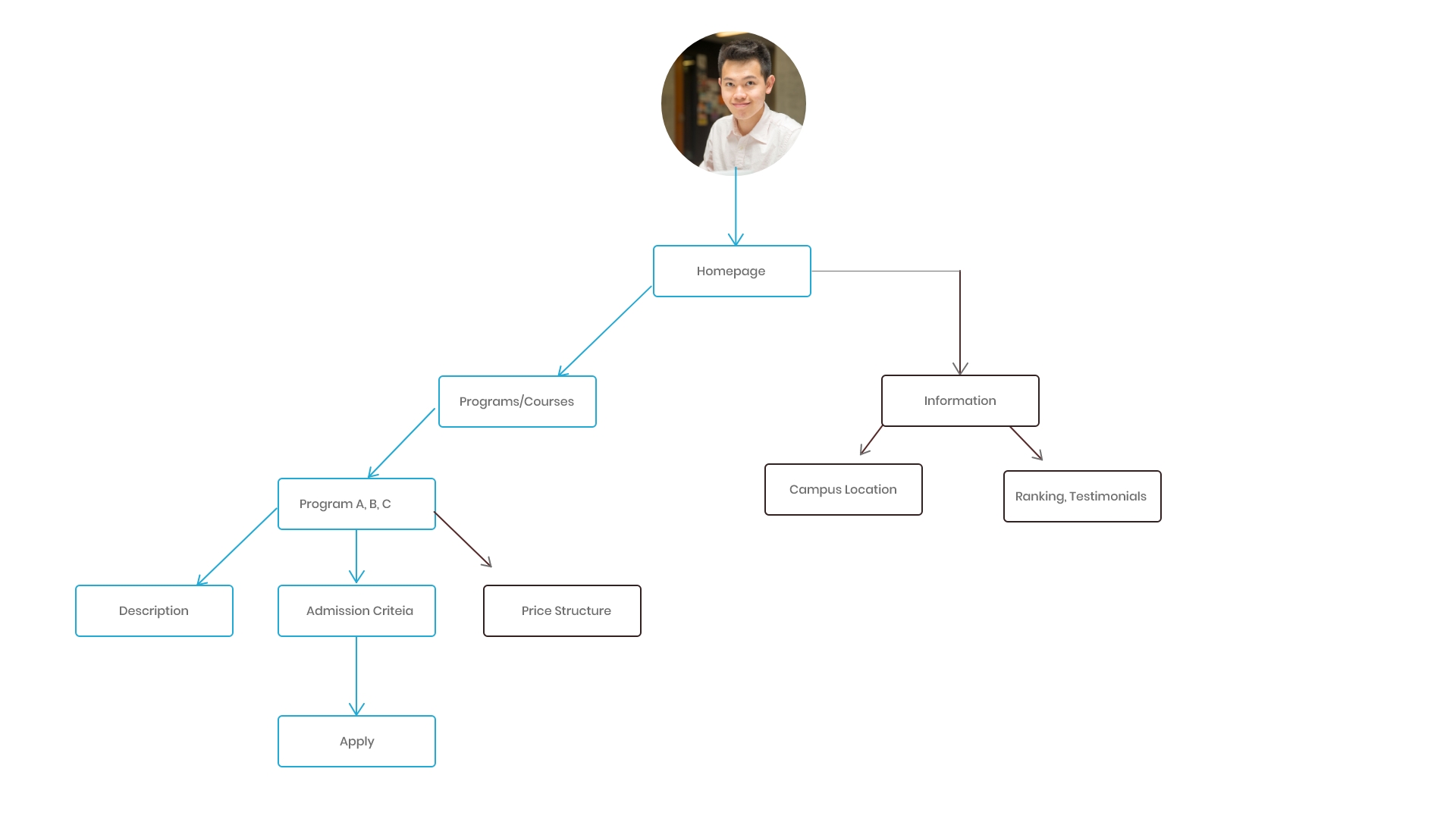
As can be seen on User Flows charts, the most likely path for both personas is through the following pages: Home Page> Programmes/Courses> Programme A,B,C. This findings should be taken into account on the stage of modeling web map.
Research
As can be seen from user flows and personas, the most important information for both personas would be a gathering of information regarding education programs. Basically, NUS website serves for 3 main groups of users:
- Prospecting students. They come to the website to investigate educational programs, admission requirements and general info, such as location of the campus, contacts etc.
- Parents. The most important for them to know how much does education costs and what kind of profession their children will get upon graduation
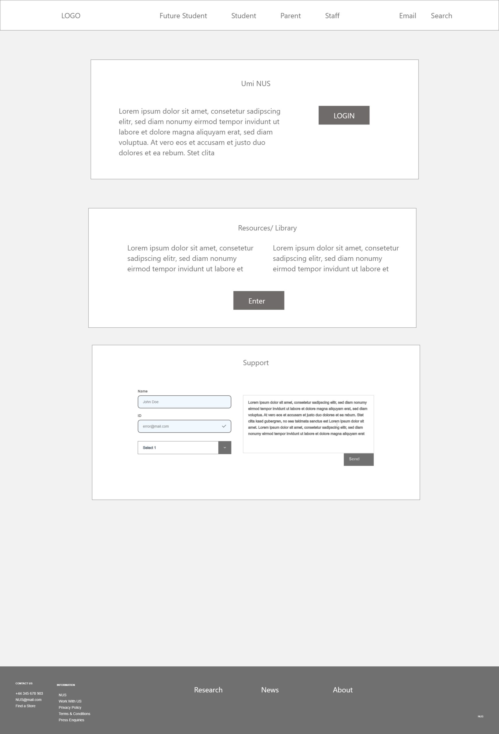
- Stuff/ existed students. They need an access to internal services such as account, email, student calendar, blackboard and etc
The typical mistake of universities’ websites is trying to put so much of unnecessary information on the homepage: photo of happy students, local news, quotes of famous people about education. In other words, they put information that most of visitors do not need.
Flaws:
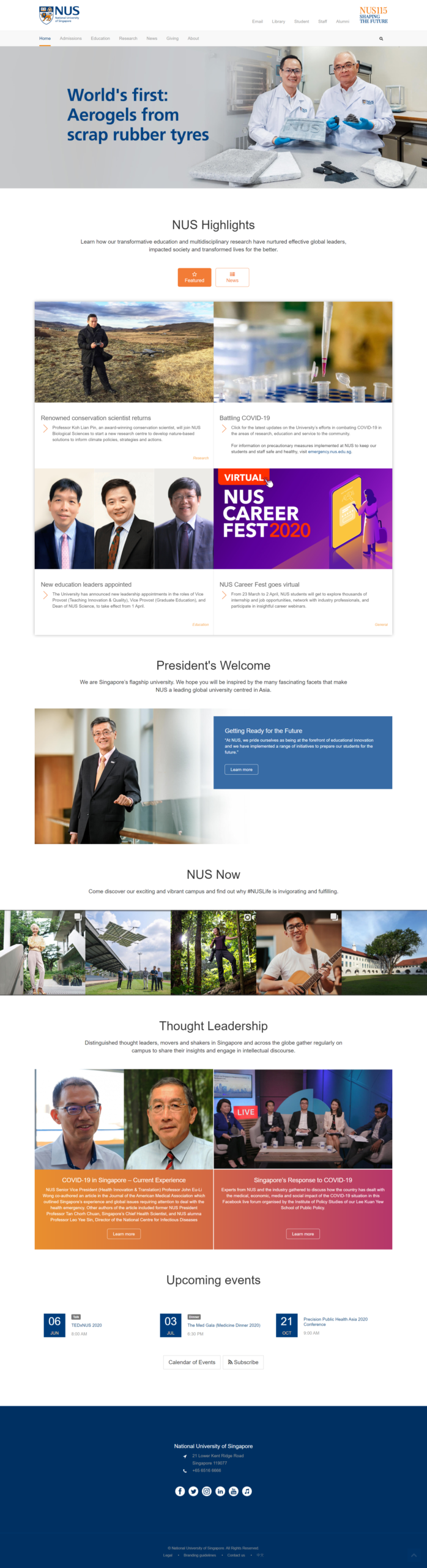
For now NUS website homepage is buzzed, complicated, hard to navigate. Links such as “Programmes” lead to absolutely irrelevant information. Users need to spend some time to figure out how they can get to the course’s pages. Visitors get distracted by irrelevant banners, animations informational noise.
There is no a search bar on the homepage.
There are 2 navigation bars, which are not distinguished by a visual hierarchy or logically
The navigation process is confusing:
- In order to find a list of offered programmes (e.g law), the user can do 2 pathways: Home >Admissions> undegrad> undegrad> faculties> Law and Home> education> faculties> law
Some labels of navigation are not clear. E.g “Giving” What does it stands for? After following a link, there is also no explanation about “giving”. If that is so important to be on the main navigation at home page, then it must be a real reason for that
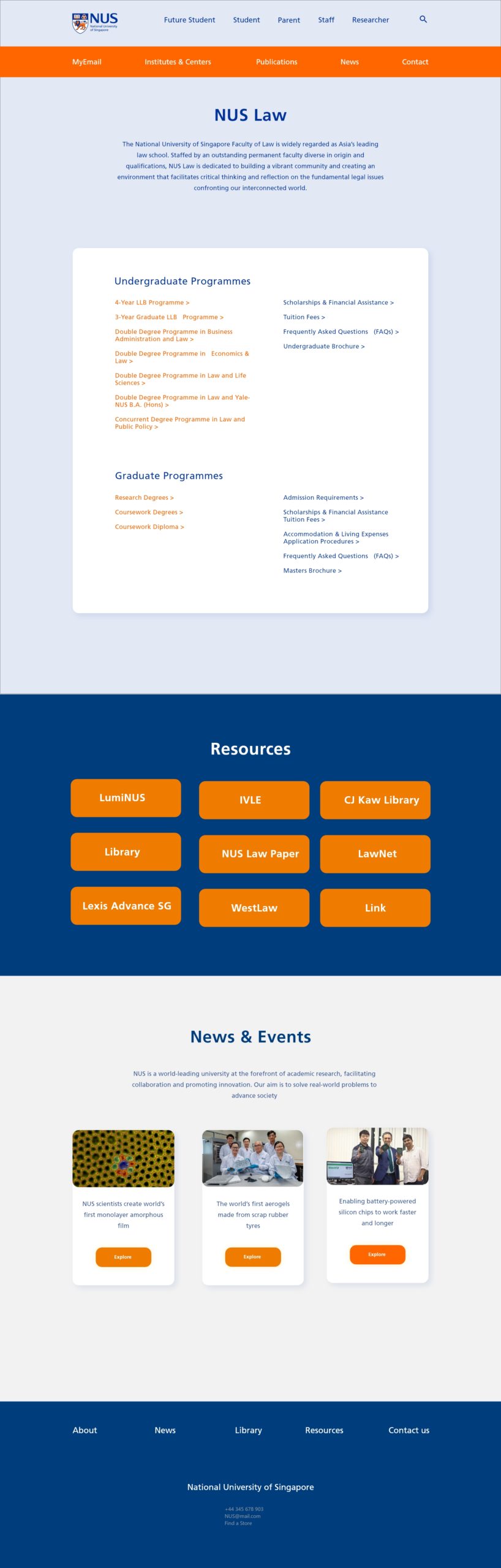
Fragmentation of the website. Every faculty is represented as a separate website with self information architecture. In most user flows it lead to a confusion as it forces users to make same path several times.
It can be seen, that UI is not a problem of the current NUS website. The flaws are discoverable in Information Architecture.
Current NUS Home Page. http://www.nus.edu.sg/
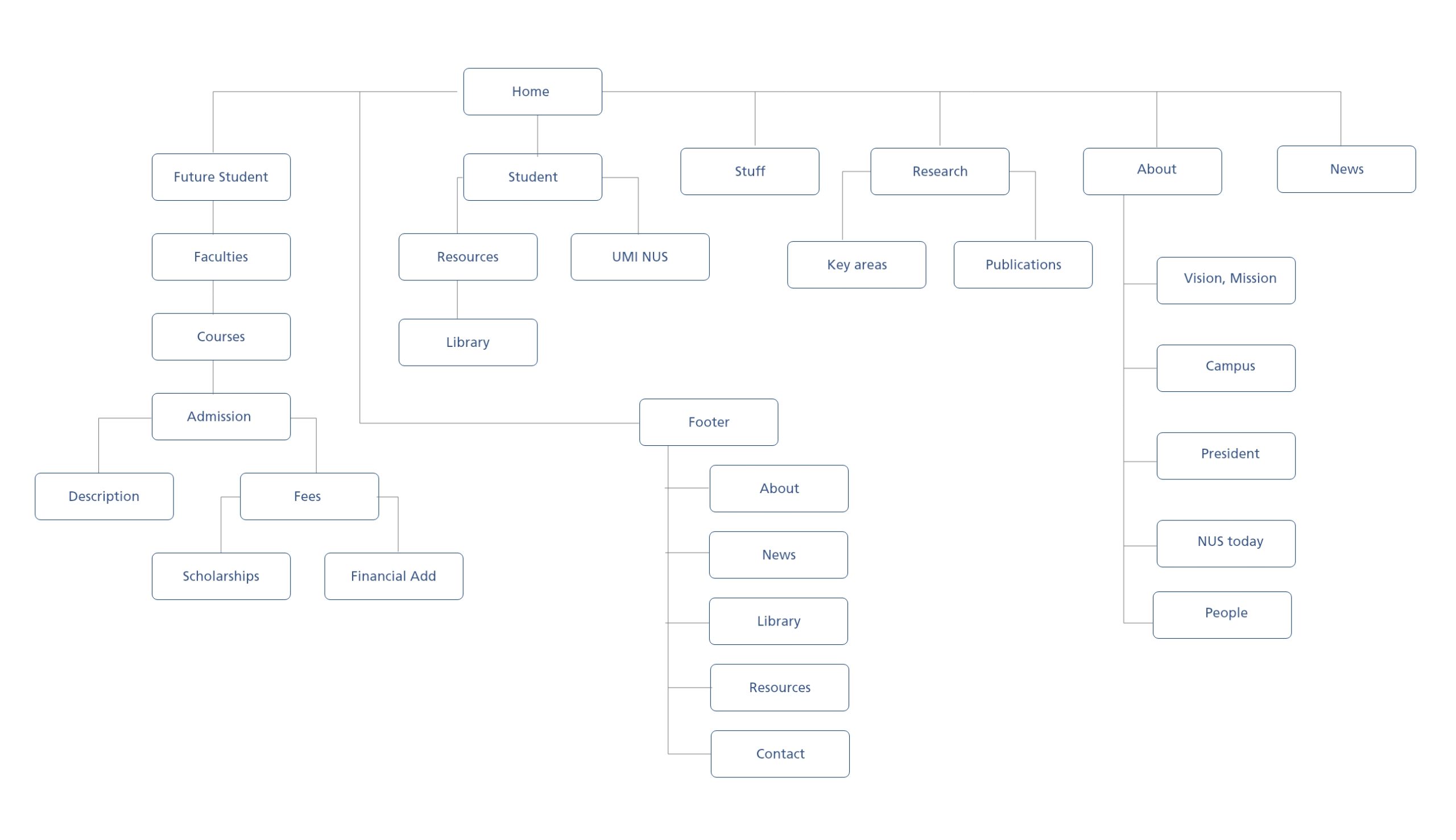
Information Architecture
The whole content has been divided on 2 groups: Crucial and Optional content.
Crucial content:
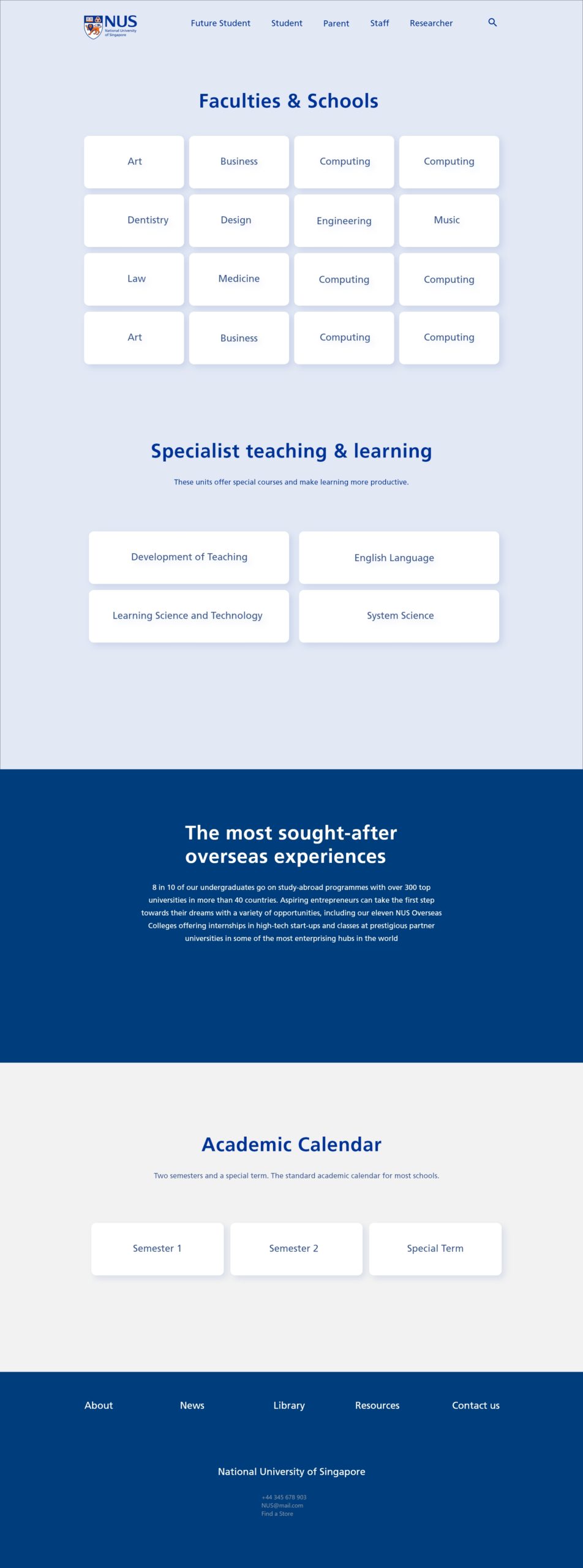
- Faculties & Schools
- Admissions
- Fees
- Financial Add
- Scholarships
- Graduate Tuition Fees
- Academic Calendar
- Programmes
- Undergraduate
- Graduate
- Executive
- Research
- Publications
- Key Areas
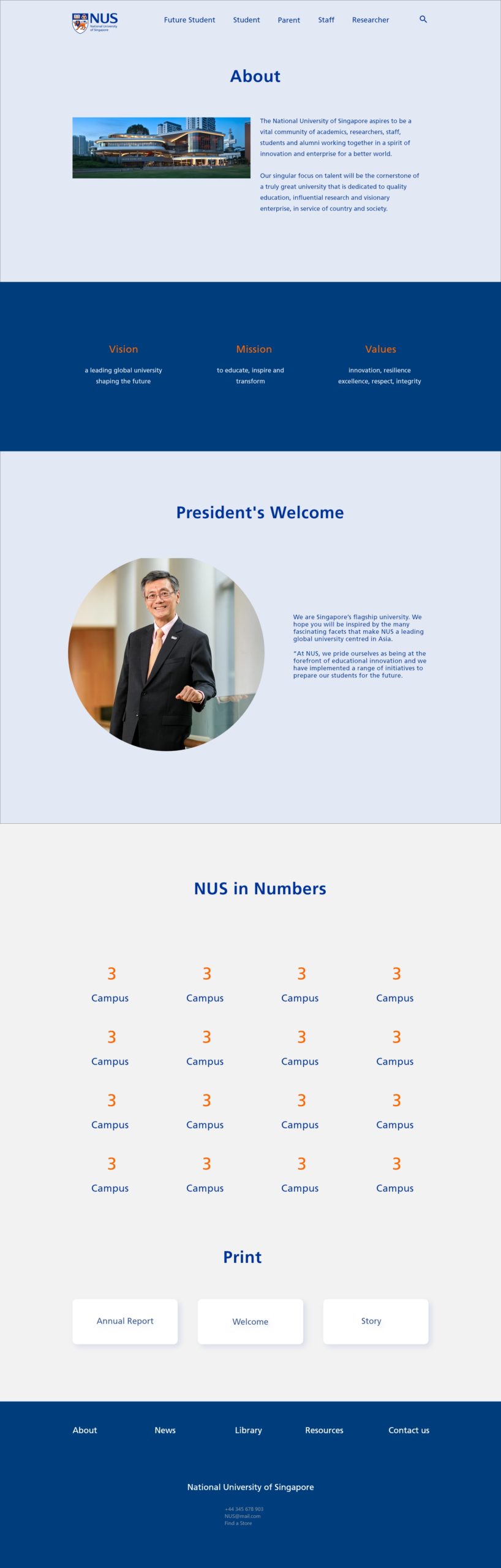
- About
- Vision,Mission,Values
- Campus
- History
- Resources
- Library
- Academic
- UMI Nuis
Optional Conent:
- News
- Highlights
- President Welcome
- Center for English Communication
- Specialist Teaching
- Student Support
To represent activities, that users execute on the website, there 2 groups have been identified as: Big Tasks and Small Tasks.
Big tasks represent the main activities, that users supposed to do on the website. Tiny tasks usually aim to distract users from doing big tasks.
“The tiny tasks are very often wrapped up in the ego of the organization. They include: senior management profiles, speeches, news and press releases, annual reports, and general information about the organization.”-Gerry McGovern
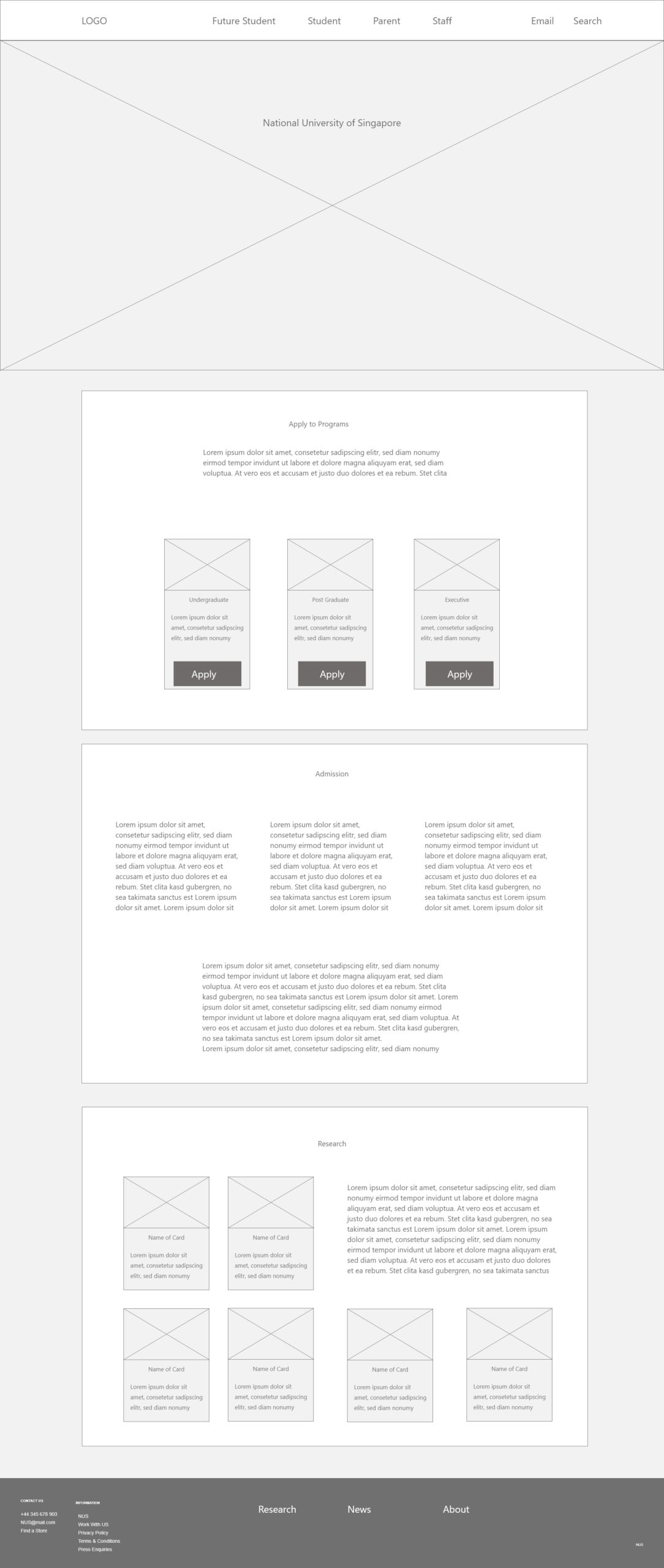
Big Tasks:
- Looking for course to study
- Comparing prices of education with other Universities
- Students and Researchers to use resources
- Internal System for stuff and Students
Small Tasks:
- Reading news
- Learning more about University and President’s welcome
- Browsing photos of students
- Figuring out how NUS is going to combat COVID-19
Sketch
Site Map
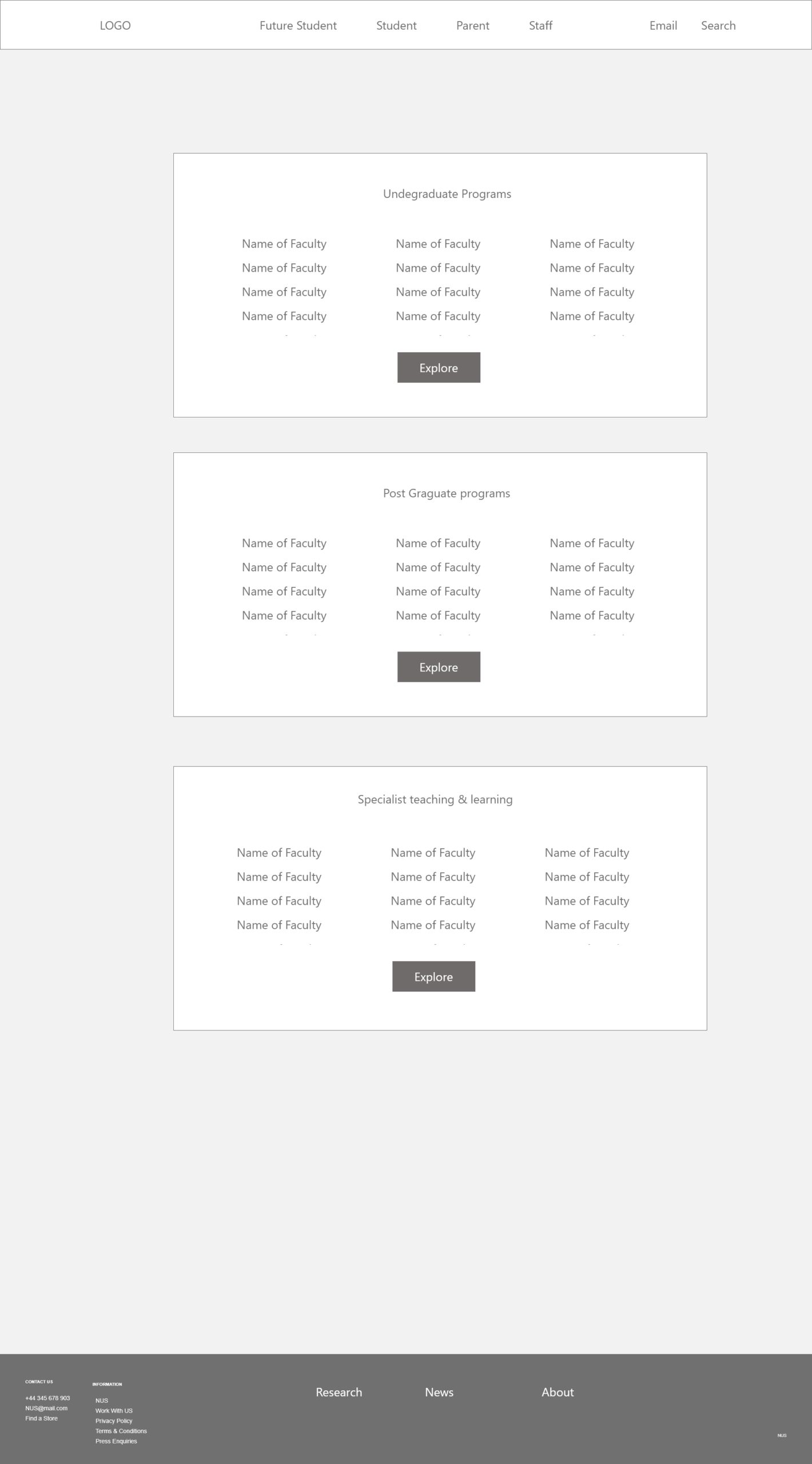
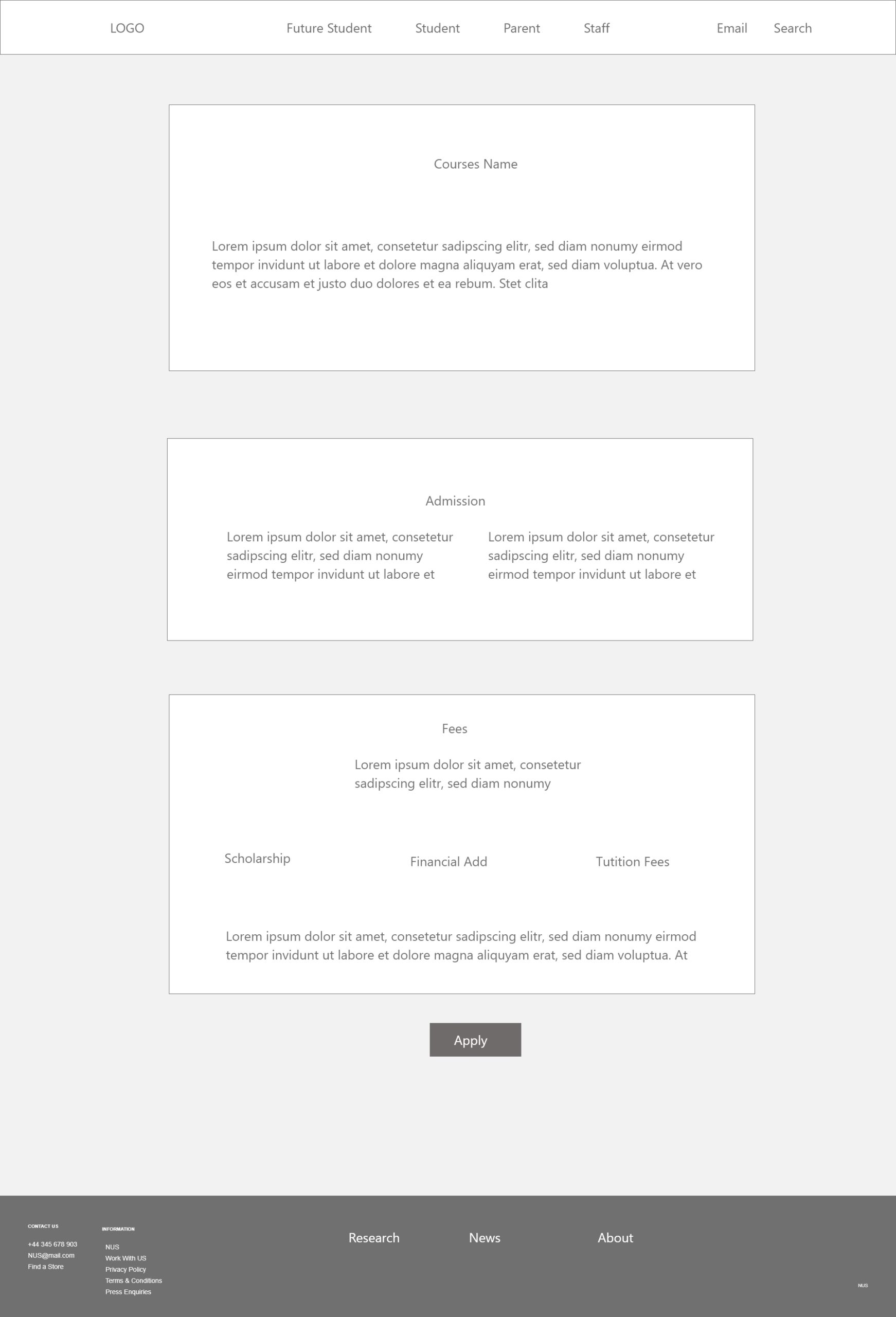
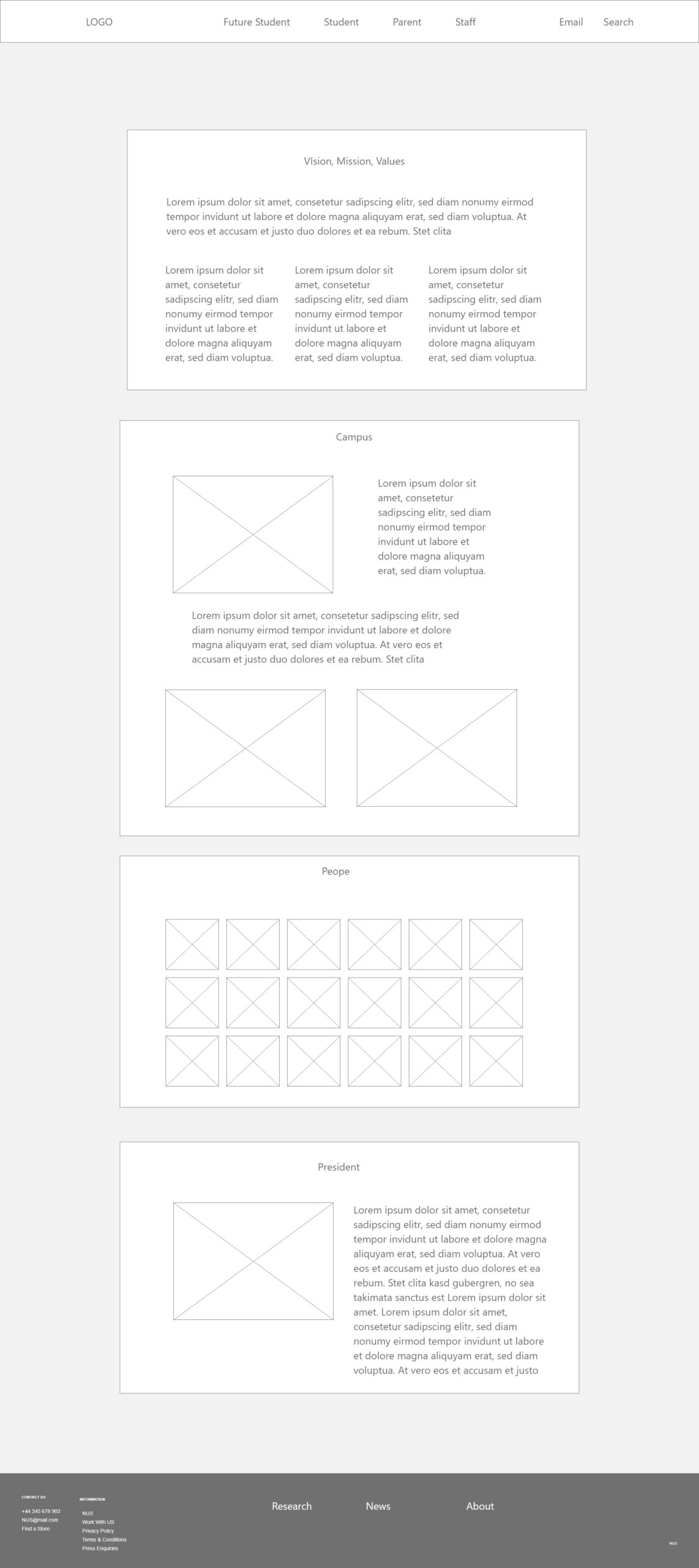
Wireframes
The most significant considerations touched a home page. Thus, it was removed all previous sections, that were not served for main purposes: giving information about courses.
Decisions:
- Top navigation dual menu has been transformed to a single line of labels by user’s type.
- Secondary menu has been moved to a footer
- Information flow has been divided on horizontal sections, which in turn are divided on 2-3-4 columns.
- President Welcome section due to a low informational value has been removed to the “About”section
- Special attention has been payed to a fragmentation of the website. Faculties were displayed as a separate websites with different approach to information architecture. Now every faculty is a continuation of the main website.
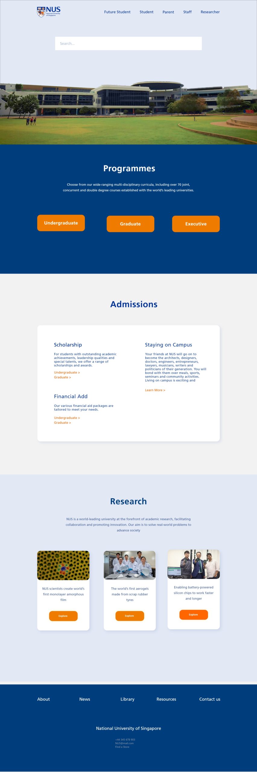
Design
Since NUS website is for informational rather than entertaining purposes, it was decided to establish a clean and formal UI system. The current elements such as colours, type faces, logos have been left in website to prevent distortion of identity and spirit.
The home pages as the most valuable touch point for users has been made with following considerations:
- Visible contrast between sections
- Full screen photo of University
- No call-to-action button
- Big search bar
- News display cards
- Irrelevant and distracting photos has been removed to the “About” section
Fonts
Frutiger LT Std
Colors
